Short winter days mean trying to make the most of the daylight hours. We thought of heading to Old Town as the weather was great the other day. Instead of getting off at the usual station we chose another one from which to walk there. Which is when we came across this remarkably interesting building. My architect wife instantly recognized this as The House of Black Madonna a premier example of Czech cubist architecture.
We sacrificed the sunshine to visit the museum that is house in this building. For me it was an eye-opening experience of a kind of style I had neither read nor seen properly before. Here are some images and comments from the experience.
The Staircase
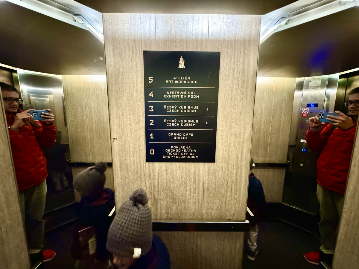
When you enter the building the first thing that will catch your eye is the quirky shape of the staircase that when you look at it from below resembles the form of a bulb. The next surprise is the shape of the elevator which is also all angles. The photo below unfortunately fails to do it justice, but I tried anyway.
The Museum
The museum is spread across 3 floors but in a small space. This means you should be able to see everything that there is to offer in less than an hour. There was a mixture of furniture, crockery, posters, paintings, and general art pieces. I am sharing just a few of the things that caught my eye
Posters
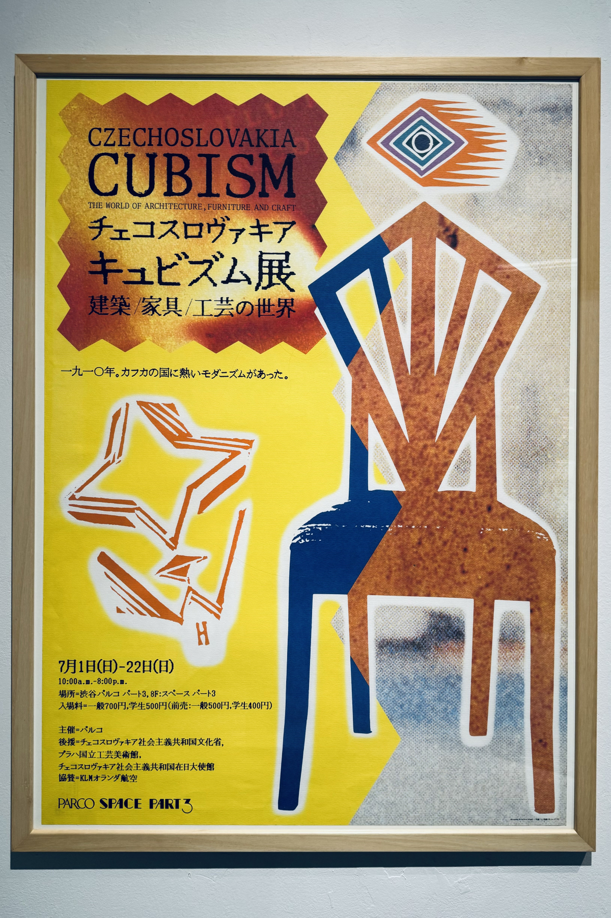
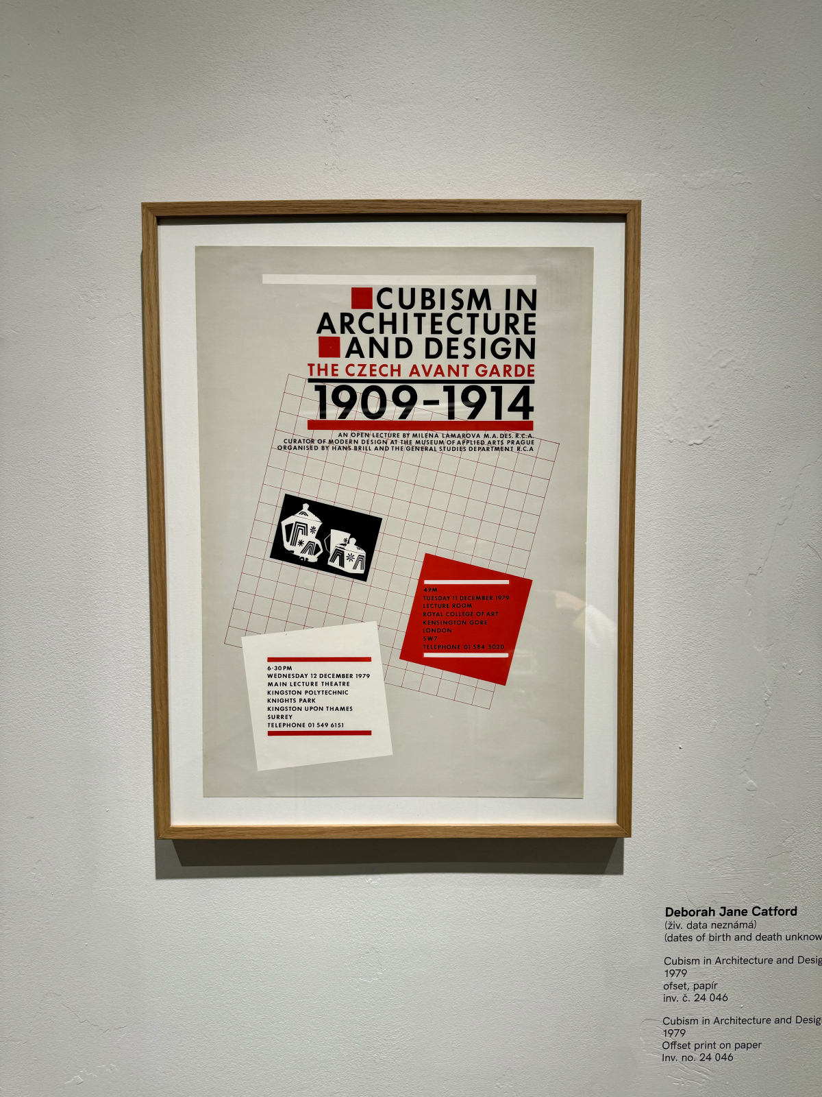
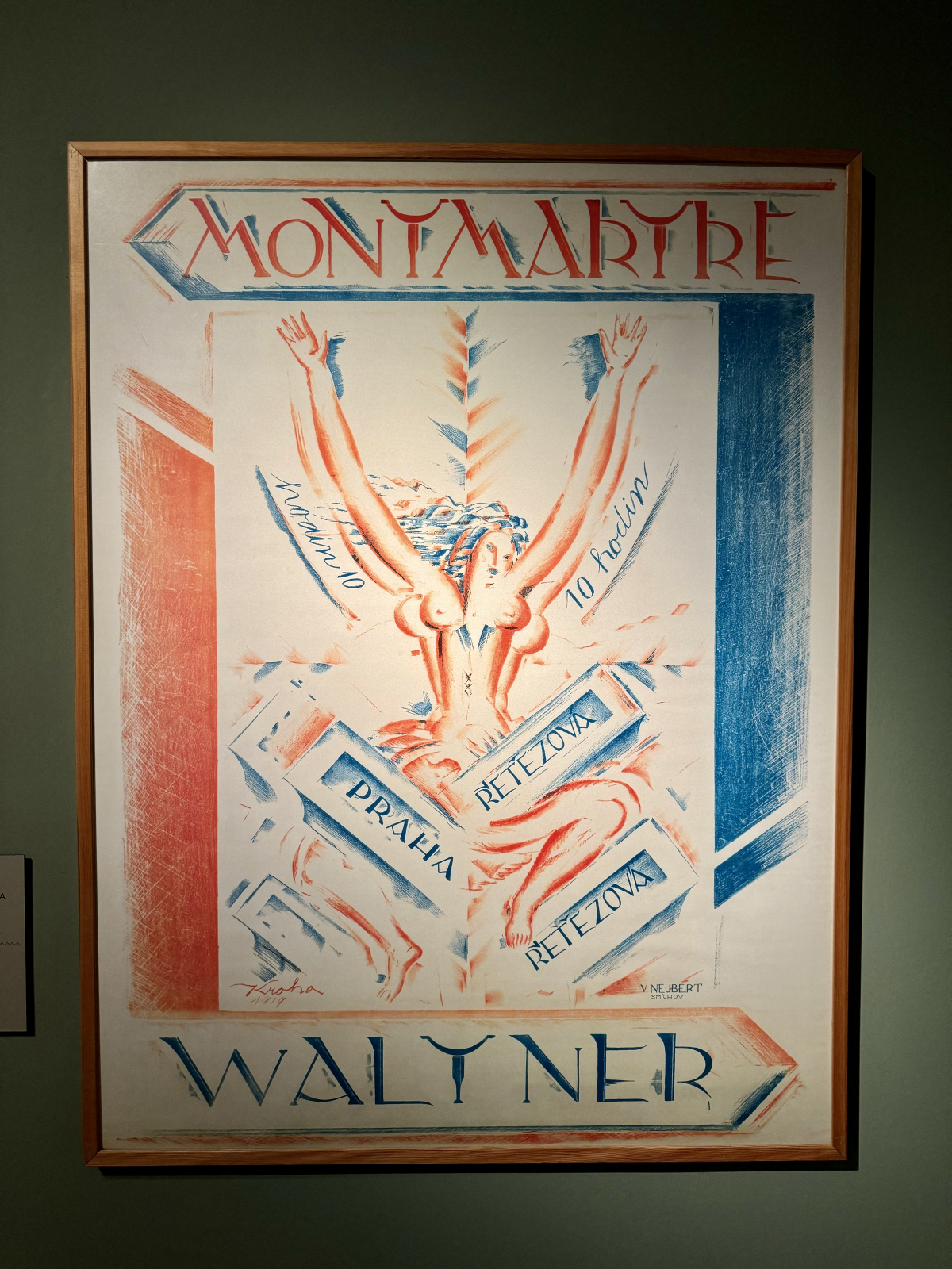
Ther were some beautiful poster designs from that decade advertising exhibitions also following the cubist style. Below is also what is called a Lithograph.
Furniture
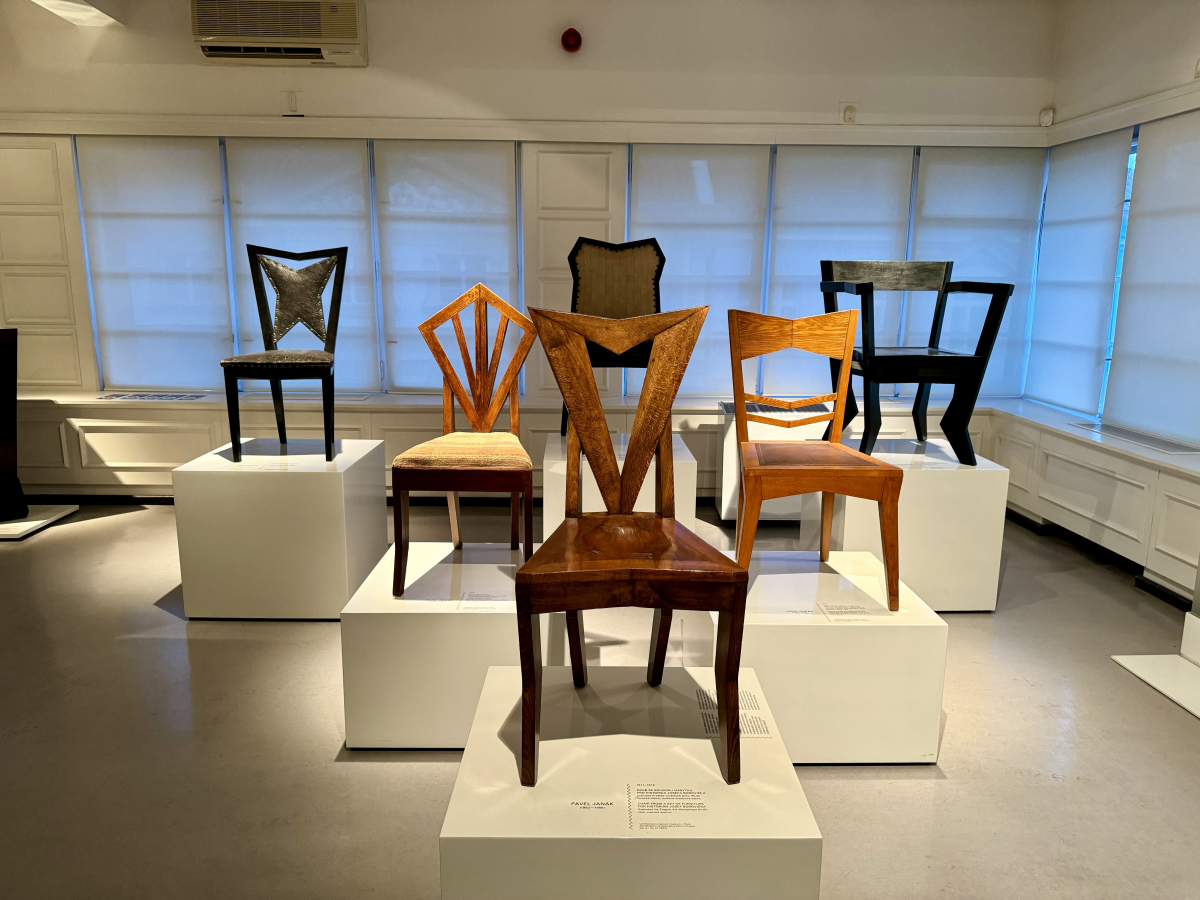
Angular furniture like this is not something that you would typically imagine but this collection of chairs was quite stunning without a curve in sight.
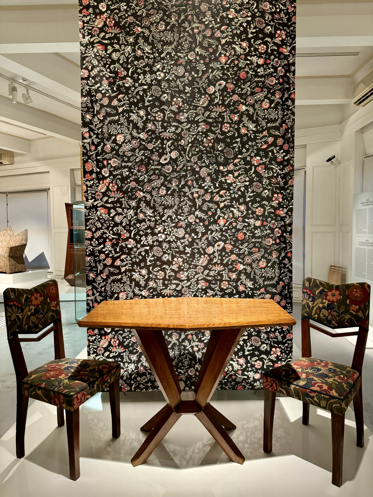
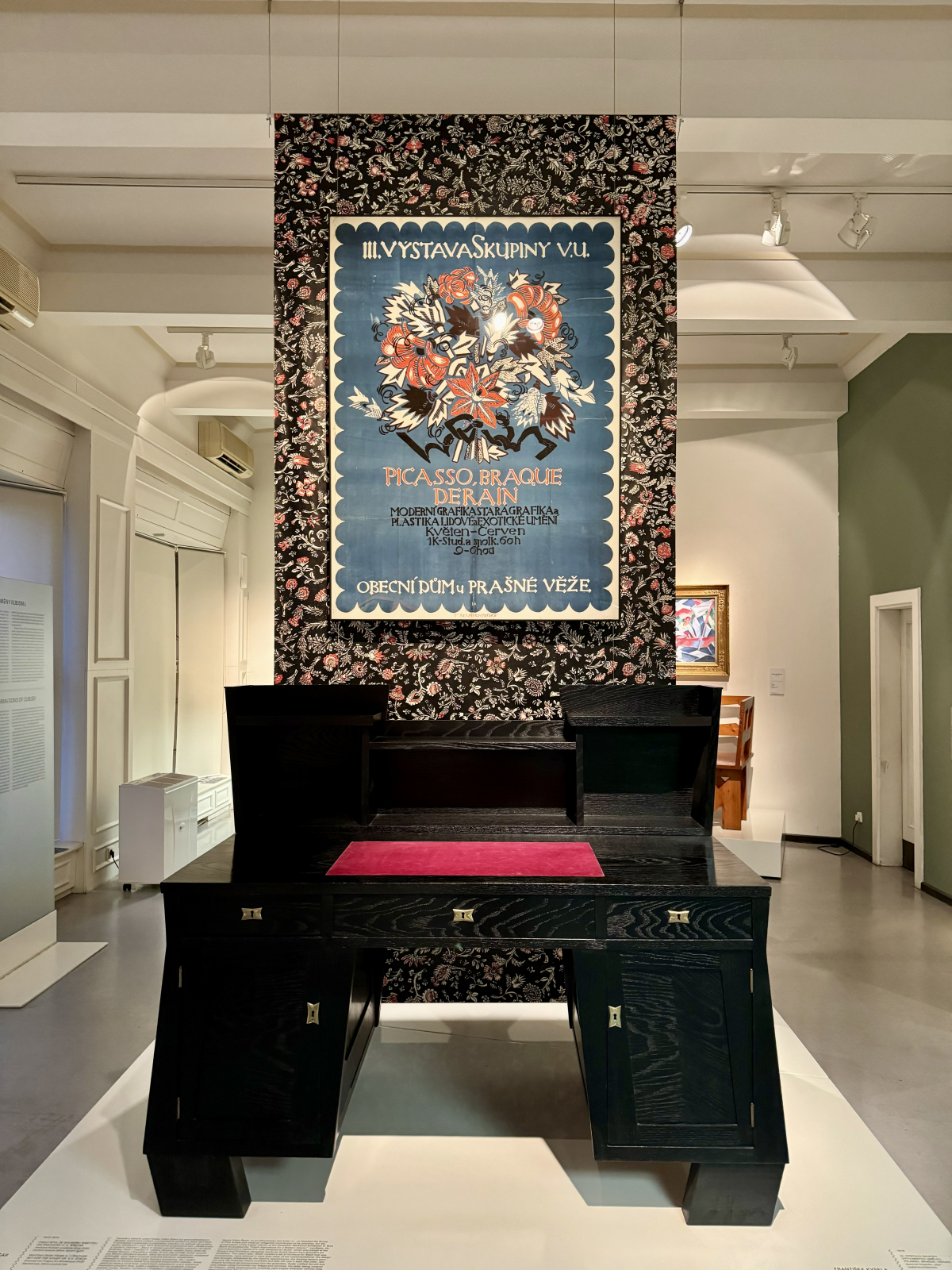
The pieces are sometimes beautifully augmented with coordinated backdrops
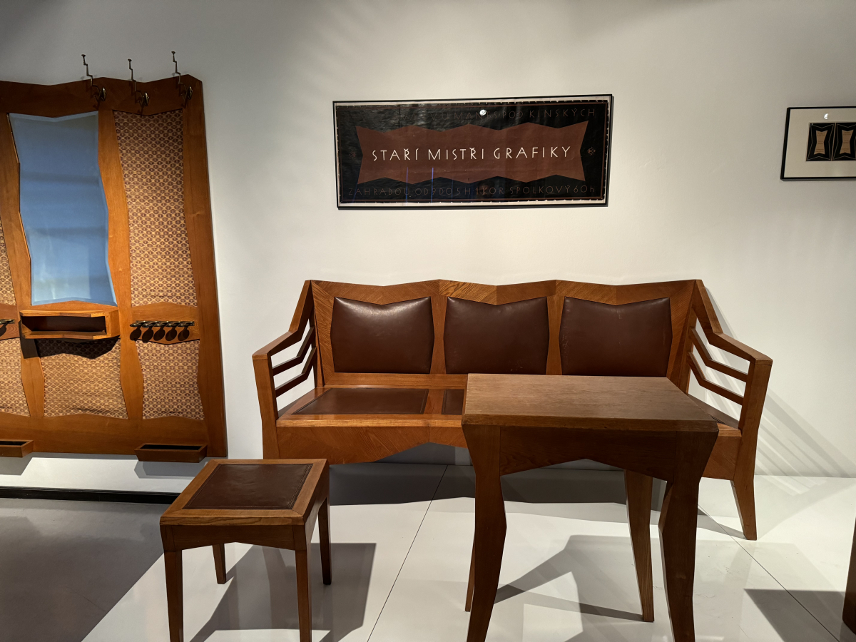
Some of them are sets of furniture that are meant to fit together.
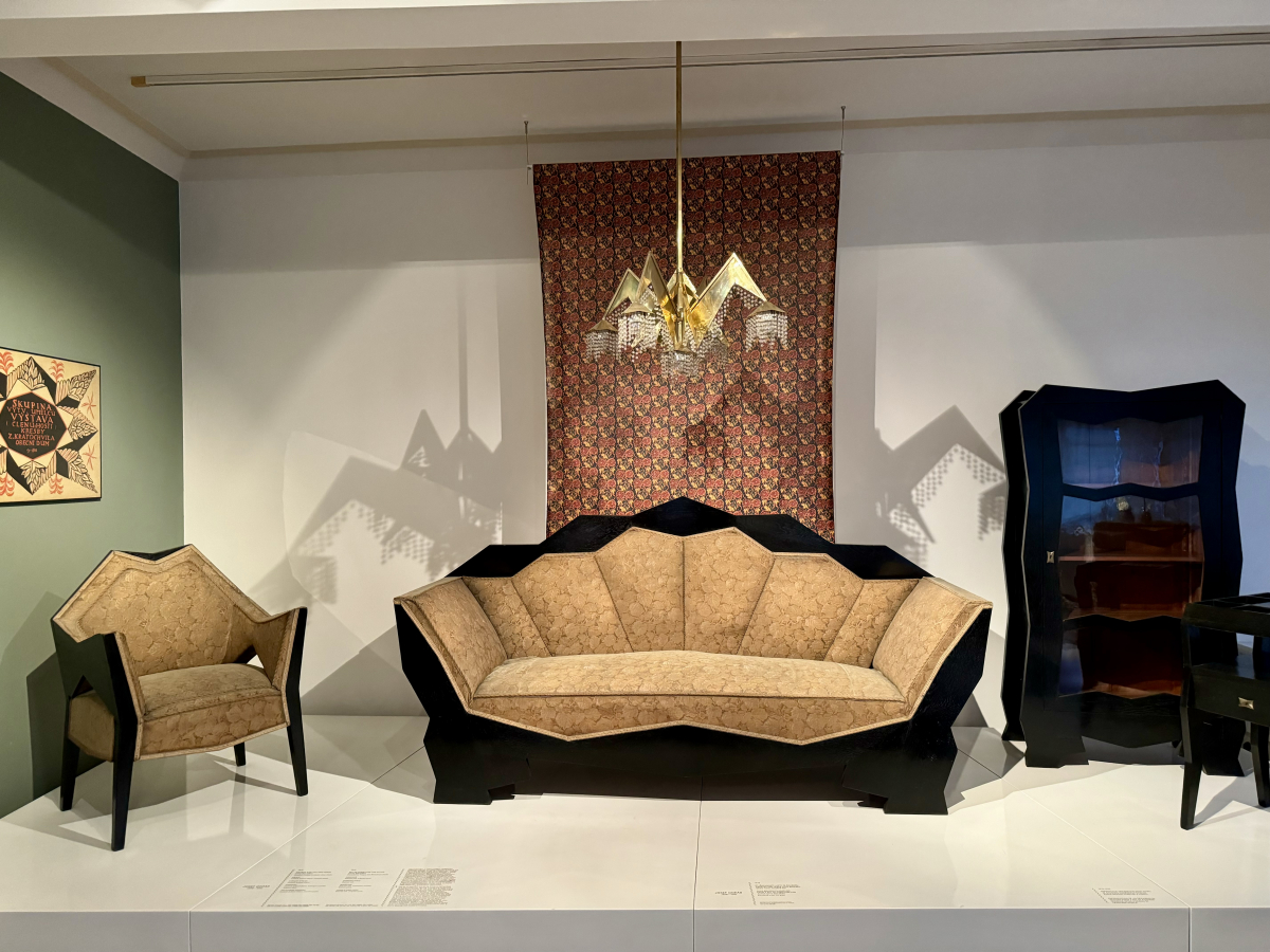
This set was the most eye catching one for me. The larger-than-life sofa. A bookshelf with a design I could never have imagined. And the most stunning aspect of the set is that chandelier which you can also see casting a monster spider kind of shadow on the wall.
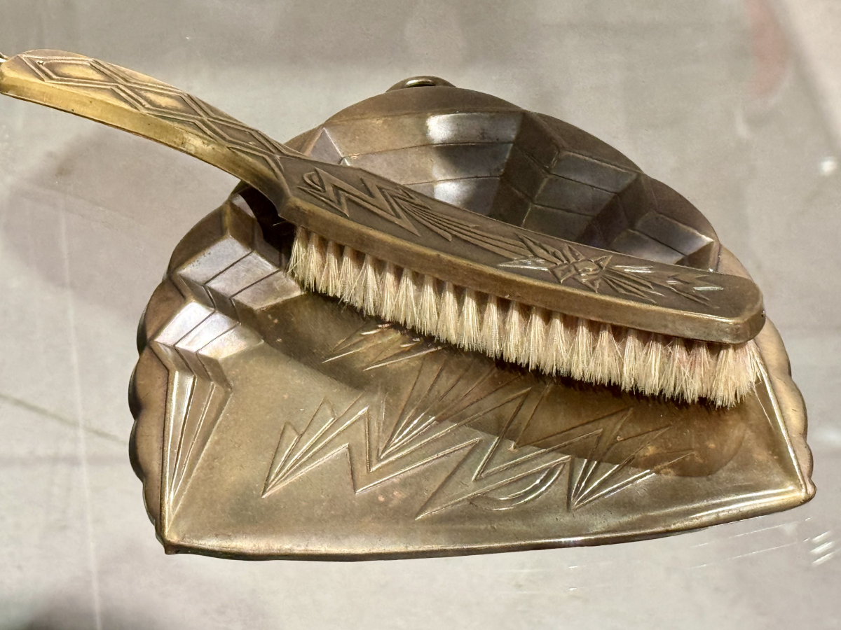
There were some beautiful crockery sets that I unfortunately didn't capture but this brush and pan set was the most memorable object from the collection for me.
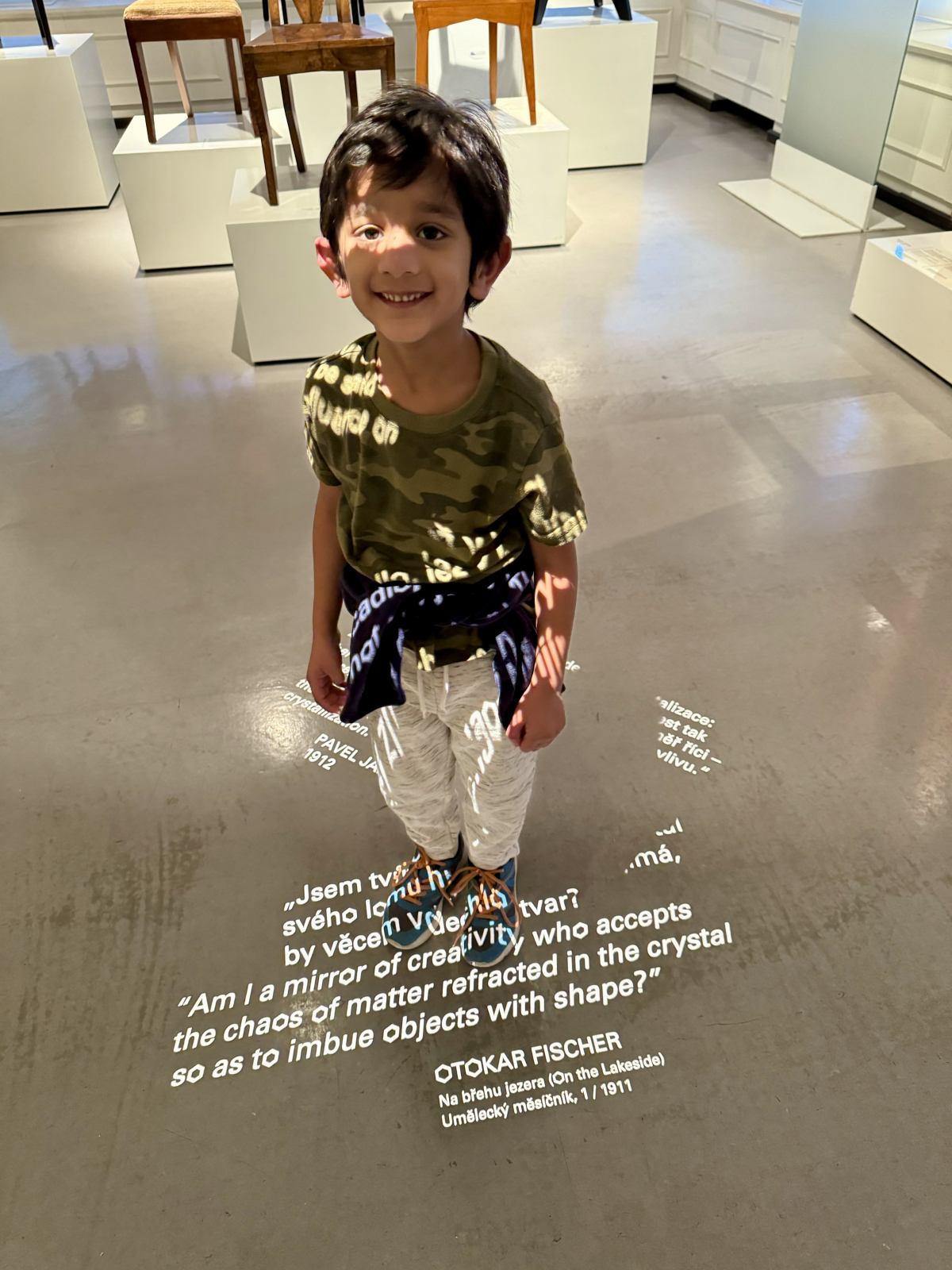
Being a small museum with plenty of opportunities to sit down, the museum is suitable for kids to accompany you without tiring out. One nice detail I loved was that the text font used throughout the museum has the letter O in the shape of a hexagon that instantly evokes cubism.
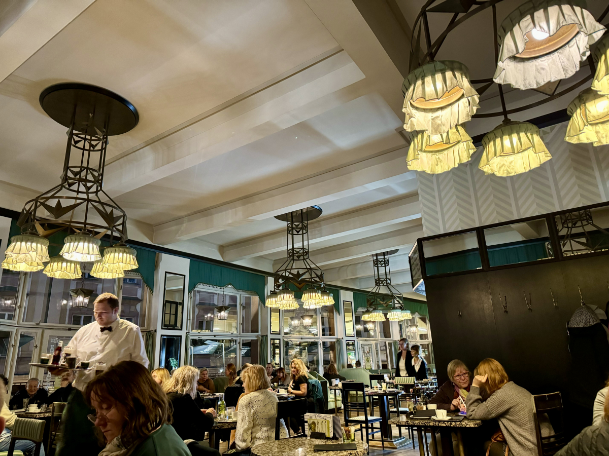
We ended our visit with some coffee at The Grand Cafe Orient that has interiors that are designed in perfect harmony with the theme of the house.
