
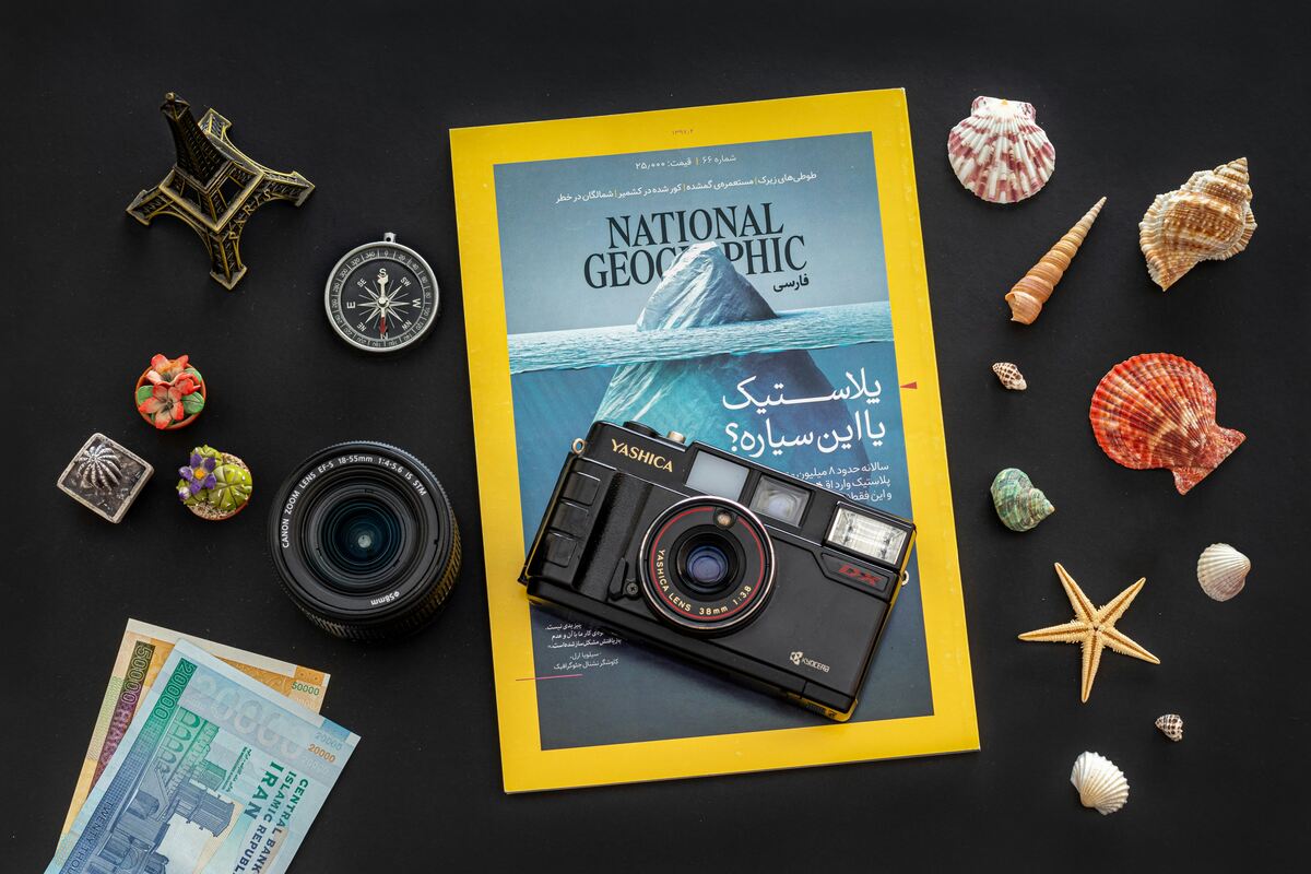
My wife recently bought me a lovely tote bag officially licensed by the National Geographic. I started thinking about something that I hadn't thought of in years. The official logo of the National Geographic is one of the simplest possible ones. A yellow rectangular frame that is similar to the design of the magazine itself. How can something so simple be so iconic? It's a testament to an enduring legacy of the brand itself and what they did over the years.
Growing up as a young boy in India I did have access to many books but something like the National Geographic available only internationally would have been impossible. But my uncle who was living in the USA for many years had a subscription for many years for us. So I got access to a treasure trove of information about places in the world backed up by some incredible visuals in a time where these things were even more precious because of the lack of the internet.
Those magazines arrived like clockwork every few months, each one wrapped in anticipation and possibility. The moment I held that familiar yellow spine in my hands, I knew I was about to embark on another journey—perhaps to the depths of the Amazon rainforest, the peaks of the Himalayas, or the vast expanse of the African savanna. The yellow frame wasn't just a logo; it was a portal.
What struck me most was how that simple rectangular border managed to contain entire worlds. Behind that frame were photographs that burned themselves into my memory: the piercing green eyes of the Afghan girl, the otherworldly blue of Antarctic ice, the intricate patterns of a butterfly's wing magnified beyond recognition. These weren't just pictures; they were windows into realities I could never have imagined otherwise.
The genius of National Geographic's branding lies in its restraint. In an era where logos compete for attention through complexity and flash, that yellow frame stands as a monument to the power of simplicity. It doesn't shout; it doesn't need to. It simply frames the extraordinary, allowing the content to speak for itself. The logo has remained virtually unchanged since its inception in 1888, a remarkable feat in our age of constant rebranding and redesign.
But simplicity alone doesn't create an icon. What transforms that yellow rectangle into something meaningful is the decades of trust it represents. For generations, that frame has been a guarantee of quality, authenticity, and wonder. When you see it, you know you're about to encounter something that has been carefully researched, beautifully photographed, and thoughtfully presented. It's a promise that has been kept for over a century.
I realize now that my uncle's gift was more than just a magazine subscription. He was giving me a passport to the world, a key to places and experiences that would shape how I saw our planet and my place in it. Those magazines taught me that the world was vast and diverse, that every corner held stories worth telling, and that curiosity was perhaps the most valuable trait one could possess.
In today's digital age, where we can access images from anywhere in the world with a simple search, it's easy to forget how revolutionary National Geographic was. Before the internet, before travel became accessible to the masses, before documentaries were streaming on demand, there was that yellow frame. It was our connection to the wider world, our proof that there was so much more beyond the boundaries of our immediate experience.
The tote bag sits on my desk now, that familiar yellow frame catching my eye as I work. It's a reminder of how powerful simplicity can be when it's backed by substance. In a world of ever-changing trends and ephemeral brands, National Geographic's logo endures because it represents something timeless: our fundamental human desire to explore, to understand, and to connect with the world around us.
That yellow frame has outlasted countless design trends because it doesn't try to be trendy. It simply is what it has always been: a window to wonder, a frame for the extraordinary, and a symbol of our endless capacity for discovery. Sometimes the most powerful statements are the quietest ones, and sometimes the simplest designs are the most enduring.
Looking at that tote bag, I'm reminded that great branding isn't about creating something new and flashy—it's about creating something that becomes so intertwined with human experience that it transcends its original purpose. The National Geographic logo isn't just a brand mark; it's a cultural touchstone, a shared reference point for generations of explorers, dreamers, and curious minds.
And in that simplicity lies its true genius.