
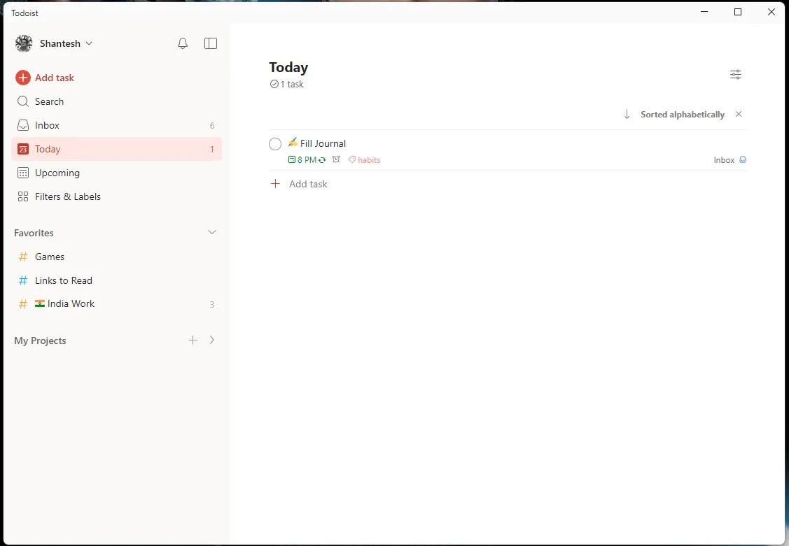
Love the new @todoist design but I also remain unhappy with a few things
- Still don't like the task button having such prominence in the menu bar.
- Font rendering on the Windows app is not so crisp. This is due to it being some hybrid web app probably
- While I respect the adherence to minimalism, I feel like the main icons in the left menu are too plain for my liking.
So, I did a small redesign for fun. - Inspired by Things by @culturedcode a little but sticking to the new layout of Todoist
- Changed the font to Inter throughout, because well Inter is the best
- Added colored icons to the left menu that are meant to be more playful
- Shifted the Add Task to the bottom right.
I'm curious if this is an aesthetic for Todoist that some might prefer.